
Anyone who remembers the original Power BI Custom Visual Gallery may recall seeing a visual called the Hexbin Scatterplot. It was the first visual that I created after Microsoft enabled custom visual development. When Microsoft deprecated the original dev tools and released the current API, all of the original visuals had to be rewritten in order to be published on AppSource.
Like the recently introduced R DataTable custom visual, I finished most of the development for the new (and arguably improved) Hexbin Scatterplot a few months ago and finally got around to getting it through the AppSource submission. I received some good news earlier, and it is now available!
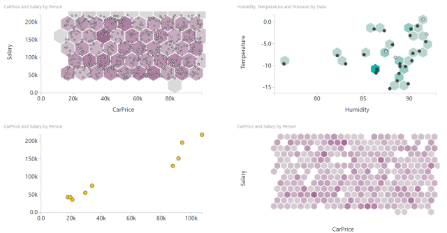
If you used or remember the original Hexbin Scatterplot, what’s different?
- Hexbins will now scale if you change the visual’s width (either as an author creating a report or as a user putting it in Focus mode). The previous version had a pixel-based hexbin radius, so resizing the visual would have a large impact on how many hexagons appeared. Since I did not want to distort the hexagon shape, resizing is based on width, so you will still see some hexagons change if you change the height but not width (or otherwise change the aspect ratio).
- Bin color now only reflects point density. There was previously an optional third measure that bins could reflect instead of density, but feedback was that users found the either/or confusing.
- I removed the “rug” that showed the distribution of points along the X and Y axes. I do not currently have plans to bring it back. Use a separate histogram if needed.
- I switched to using D3’s hexbin plugin rather than custom hexagon code.
- What’s included in bin Tooltips changed a bit.
- The points and hexagons redraw when you resize the visual rather than have an animated transition. This prior effect was admittedly fun to watch, but I sacrificed it to get the visual out the door.
This will likely be the last custom visual I release for awhile under my own personal Office developer account (A voucher for a dev account is an MVP benefit. Thank you again Microsoft!). Instead of new custom visuals, I’ll probably be catching up on maintenance for Image Timeline, R DataTable, and Hexbin Scatterplot. The idea pipeline runneth not dry though, and you might see some of my visuals such as R PivotTable appear from BlueGranite on AppSource when the time comes.
To obtain Hexbin Scatterplot in Power BI, choose the option to Import from Marketplace, or download it from AppSource: https://appsource.microsoft.com/en-us/product/power-bi-visuals/WA104381492
Here are the currently available Format options:

Will this visual ever move towards being able to manually input the x and y axis start and end values?
I’ll add it to the backlog to include axis options like built-in visuals
https://github.com/deldersveld/pbiHexbinScatterplot/issues/4
David that’s great news. I actually came here to see if that was possible.