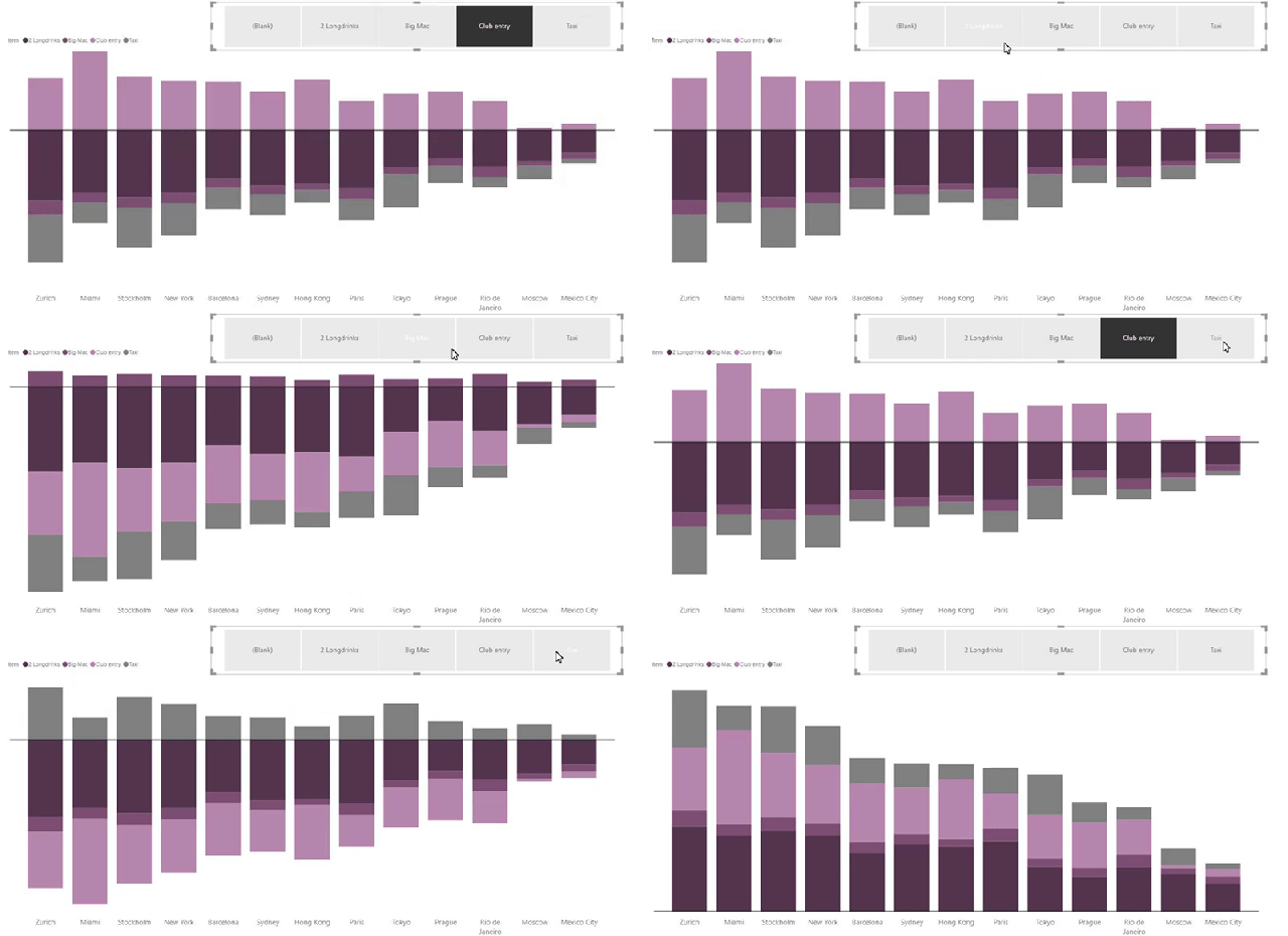
Makeover Monday this week focused on a variation of the “Big Mac Index”, where costs for various activities are compared in different cities. The original article presented data in a stacked bar graph, and the idea is to potentially look at ways to improve upon the visualization. While bar/column charts as a whole are probably the best choice in many circumstances, problems with stacked bar charts are well-documented. Would a dynamic stacked bar/column chart that allows viewers to center their focus on a selected category be any better?

I’ve already explored a method to create diverging bars in Power BI, but that only had two categories. It was a bit easier to focus on a zero baseline with only two. What happens if you want to extend the idea with more than two categories? What happens if you want to dynamically change the alignment of these multiple categories so that the category of concern starts at a zero baseline?
Dynamic Stacked Bars / Columns
The vision was to create a visualization to change the slicer selection so that the visual shifts focus. The selected category appears above the zero baseline, which allows viewers to better concentrate on that aspect of the data. Non-selected categories fall below the zero baseline. As an additional bonus, the chart simply appears as a standard stacked bar if no category is selected.

How To
To accomplish this in Power BI, try adapting the following steps to your own data. The Makeover Monday dataset is available on Data.World (week 48 of 2018). Get the PBIX file from Dropbox to more easily follow along as well.
- Load the data into Power BI Desktop and create a separate table containing the field that will eventually be used for selections. Since this dataset is a simple flattened table, I created a quick second table using DAX that only had the distinct Item values. I could have used M or a simpler DAX formula for Items = VALUES(Data[Item]). Since this particular dataset focused on a category specific to “Party Night” items, however, I ended up using CALCULATETABLE to filter down the items to only those in the “Party Night” category.

- Add a relationship between the main data table and the new table. I originally got this working with a disconnected table, but I changed it so that it could be used with a more universal data model with related fact & dimension tables.

- Add a primary measure that includes a variation on ALL() so that a selection will not filter down the bar/column chart to the selection only. My measure was called Cost and was built as CALCULATE(SUM(Data[Cost Base]), ALL(Items[Item])). The Tooltip will display this as well, which represents the positive value of the data.

- Add a secondary measure that drives the display of the bars. This measure will handle both the positive (selected) category while also dynamically handling negative (non-selected) values. Display Cost is the name of the measure, with the formula:Display Cost = IF(NOT(ISFILTERED(Items[Item])),[Cost],IF(SELECTEDVALUE(Items[Item]) = LASTNONBLANK(Data[Item],1),[Cost],[Cost]*-1))The initial IF checks whether a filter does not exist on the separate Item table, and if true, displays the [Cost] measure (all positive). When false, a nested IF compares the selected dimension field with the related field in the fact table. If true, the value is a positive [Cost]. If false, the value is a negative [Cost]. This is the measure that drives the dynamic baseline at zero.

- Add a stacked bar or stacked column chart to the Power BI report canvas. Be sure to add the Display measure to Value and the field related to the eventual selection to Legend. Add whatever categorical field you want to Axis.

- Place a slicer on the report canvas. Add the field from the related dimension table to Field for the slicer.

- Format your visuals as needed.
- Optionally, go to the Analytics pane and add a Constant Line at 0. This helps direct viewers and makes it easier to find the dynamically shifting zero line.

- Test the behavior of the stacked bar as you make selections. The current selection should appear above the zero line while non-selected categories appear below the line.

Issues
My two primary issues with this visual as constructed above pertain to the default tooltip and data labels. Since the Values rely on Display Cost with negative values, they appear in the tooltip in addition to the positive Cost values. Power BI currently does not have a way to omit fields from the tooltip (Report Page Tooltips are a workaround). A similar issue exists for the negative values in the data labels. Expression-based formatting has been announced for Power BI though. I’m hopeful that whatever that eventually looks like, it will include the ability to either display negative values as positive ones and/or allow us to conditionally hide labels so that only the positive ones based on the selection would display.
Alternative
Particularly with cross-highlighting available between visuals in Power BI as well, perhaps its better to leave stacked bars alone and instead encourage the effectiveness of interactivity. In most cases, I’ll probably opt for a combination of two visuals to represent the data, then focus on part-to-whole contributions by clicking on bars. Here is a look at my final makeover where I moved away from the idea of stacked bars altogether.

Interactive version:

1 Comment