
This past Tuesday, April 9, I was fortunate to present two sessions at the Power Platform World Tour in Chicago. The first session was Practical Tips for a Successful Power BI Deployment geared toward the new/business user audience. The second was Exploring Maps in Power BI. Slides from both sessions are available (requires free registration for the Power Platform User Group site): http://powerplatformworldtour.com/materials
Many thanks go to the programming committee for selecting me to speak at an event within driving distance. Thanks to Rose Spitzer in particular for providing onsite coordination and for leading a great conference. Having a young family, I haven’t had a chance to attend many in-person community events recently. It was a good experience to both attend and speak.
If anyone is interested, here is a glance at some of the map demos from my second session. I had originally embedded all six “live” reports in this post, but that caused mobile browsers to crash. To view the reports, simply click where noted.
Proportion of Road Fatalities by Country
This two page report illustrates the danger of plotting data on maps simply because the data contains a geographic field. In the case of proportion of road fatalities, it may appear based on viewing choropleth (filled) maps that Thailand has the highest proportion of 2-3 Wheel Vehicle fatalities and the Netherlands has the highest proportion of Cyclist fatalities. Moving to page 2, however, and looking at the bar charts, it’s evident that the bar charts provide a more accurate picture. The small countries of San Marino and Kiribati had the highest fatalities for 2-3 wheel vehicles and cyclists respectively. Mapping with area and still providing accurate insights can be a common problem. Emphasis tends to be placed on countries with large geographic area while small countries barely register to viewers.

Where Do People Move?
This report page focuses on state to state migration in 2015 and showcases two map options for Power BI: a hex map using the Synoptic Panel custom visual and the Flow Map custom visual. While the Flow Map is a jumbled mess when everything is plotted at once, selecting a single state from the hex map allows viewers the chance to see movement from the origin state to each destination state. The hex map, by the way, solves the previously mentioned area problem by using consistent sizes for each state. The trade-offs are lack of geographic accuracy and distortion of shape.

Infant Mortality
The Drilldown Cartogram custom visual is the focus of this report. The cartogram available in this case is a Dorling cartogram, which uses packed bubbles of various sizes. A more common type of cartogram that you may be familiar with distorts an area’s shape instead of replacing the shape completely with circles. The idea behind this visual is to emphasize a story at the expense of geographic accuracy. It’s evident that countries in Africa collectively have higher infant mortality, but the placement of bubbles don’t align to physical locations well. Nor should they. The map simply draws viewers’ immediate attention to something important–it’s not studied in depth.

Great-Circle Distance / Radius Around a Selected Point
Users sometimes require the ability to see all points within a radius around a selected point. While Power BI will not draw a circle, the actual points are available for analysis. This technique relies on building the Haversine formula for calculating distance on a sphere into a DAX measure. I wrote about this map in detail back in March. Changing the Maximum Distance parameter dynamically updates the points on the map to only show ones within the relevant distance.

Seattle Bike Theft
This report showcases the Mapbox custom visual alongside a very embarrassing and quickly crafted ribbon chart. Primary points during the talk were the use of custom Mapbox styles as well as showing density through the use of clustering as the zoom level changes and heatmaps.

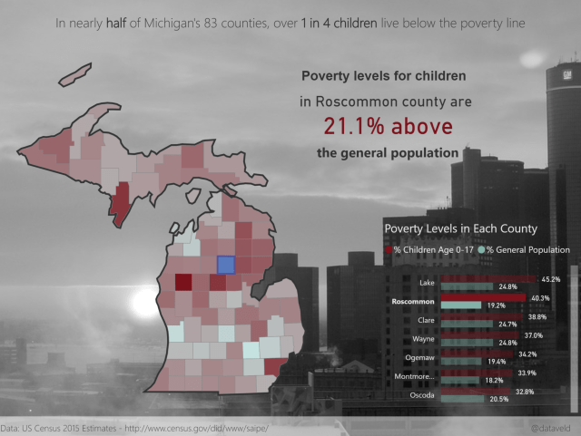
Michigan Poverty
I ran out of time before showing the Shape Map and building maps with custom TopoJSON. This is a topic that I have written about before though. This report has one primary trick. If you click on a county in the bar chart on the first page, the county highlights on the map while all the other counties still appear. This behavior is not part of the Shape Map per se, but it’s a result of different visual interaction settings when more than one Shape Map is overlaid. In this case, there are three maps overlaid: the top one highlights the county selection, the middle one displays measures via color saturation, and the bottom one provides the wide black border around the state of Michigan.
This is some fantastic stuff David. Thanks.
Thanks Dave. I appreciate the support!
which visuals did you use to create this maps ?
With the exception of the great-circle example, which uses the standard Map visual, the description associated with each report notes the visual/custom visual used.
Hey David, it looks like you have to have attended a World Tour event in order to see the content for that location.
Thanks for calling my attention to that. I thought at first glance that you only needed the User Group login, not have to have registered for a World Tour stop. I’ll look into alternative methods to post the slides.
Impressive and beautiful work. Thanks for sharing!
Thanks!
Hello! Do you use Twitter? I’d like to follow you if that would be ok.
I’m undoubtedly enjoying your blog and look forward to new posts.
@dataveld