
Microsoft’s Power BI [Paginated] Report Builder is the newly rebranded version of the venerable SQL Server Report Builder. These static reports have been around for years, but there’s still some room for innovation. For example, Power BI allows designers to import custom visuals into Desktop reports to enrich them beyond the default visual options. What do we get with paginated reports?
Paginated reports have a number of built-in chart options including tablix (table, matrix), gauge, maps, sparklines, and numerous other chart types.

While there’s nothing directly akin to true custom visuals in Report Builder, paginated “custom visuals” could be crafted using a few different techniques. How can we create different chart types in Report Builder when they are not one of the default chart options?
As an initial example, let’s consider a waffle chart. This chart provides the proportion of a total by visually coloring a section of the grid to match the contribution to total. Most waffles consist of a 10×10 grid that shows % of total using color.
The following waffle example reads from left to right.

The following waffle example reads from bottom to top.

There are at least three ways to accomplish a waffle chart like the above examples in Report Builder:
1) Tablix & Code
One method is to use a tablix and some VB code. Jason Thomas outlined this years ago. While this works for a waffle chart and perhaps other grid-style visuals, it does not have much versatility beyond the constraints of rows and columns in the tablix.
2) Shapefile
If you want more versatility, you can create a shapefile using a tool like ArcGIS or QGIS and add it to a Map layer. You can create any kind of design and go beyond the grid limitation of the tablix. The downside of a shapefile is that if you want to adapt it in different ways, you would need to create multiple shapefiles and somehow switch between them. A shapefile is static.
3) SQL Server Spatial Query
Another way to create “custom visuals” in Report Builder is to use either SQL geometry or geography data types in a spatial query and then add that field to a Map layer. The primary downside is that you need to use SQL Server to run everything. If you can get beyond that limitation, however, it opens up a world of opportunity.

How’s that? Isn’t SQL geography and geometry stored in a database, so it needs to be predefined just like the shapefile would? Typically, a SQL spatial query is. The data is expressed in a spatial dataset and then joined to a separate analytical dataset.
Why not create your own spatial dataset at runtime dynamically based on your analytical dataset?

SQL’s geography and geometry can be expressed in well-known text (WKT) format. Points, Linestrings, Polygons, and Multipolygons can all be stated in an easy to read and parse form. With this in mind, you don’t have to start with existing shapes, lines, or points. You can calculate your own coordinates and build your own geographic/geometric features dynamically in a SQL query. This allows you to generate visuals that are data-driven rather than rely on predetermined shapefiles or SQL spatial data.
Getting Started
The waffle chart is a good starting example because we only need four points to draw a square polygon. Squares are also easier geometry than many types of more complex shapes to help introduce the concept of dynamically creating a spatial dataset. For simplicity, pretend we wanted to dynamically simplify the 10×10 grid to 2×2 grid. In the n=4 square sample grid below, we would need to calculate the four coordinates that define the square as a polygon shape. Assuming that we’re working on a 2D plane that spans from (0,0) to (1,1), we need to determine the x and y coordinates for each square in relation to the entire grid.
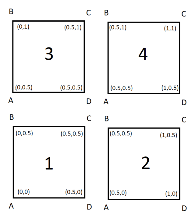
While this 2×2 grid is highly inaccurate compared to the 10×10 grid, it hopefully gets the concept across.

How does dynamically generating the coordinates work? In the upcoming Part 2 of this topic, I’ll step through the basics of how I use recursive common table expressions in SQL to help generate coordinates dynamically.
Be careful though. Dynamically creating SQL Geometry or Geography is the Paginated Report Builder equivalent of creating dynamic SVG image measures in Power BI Desktop. No one asked for it, few have a use for it, it’s tough to comprehend, but it’s kind of a fun technique.

Very cool application of spatial functionality! Though at some point I do hope they either allow the importing of custom visuals into Report Builder (similar to the idea they have tossed around about Excel) or create a way to easily create paginated report custom visuals. This could really help breathe some new life into the product.
I wouldn’t hold out too much hope on custom visuals, but who knows what types of investment may be put in. SSRS was written off as dead a few years ago and suddenly came back modernized.
Any chance to show an svg image in the paginated report?
Not sure how to do this in paginated.