Orthographic projection is a way to use two-dimensional space to represent three-dimensional objects. In Microsoft Power BI, this 3D effect can be achieved quite easily if you have a set of coordinates in three separate columns that compose (x,y,z). In the following sample, I used a dataset with coordinates taken from the profile of a human face and built a report that allows users to rotate the face along three axes.

Let’s take a look at how to build it.
Data
Obtain a dataset that has coordinates in three separate columns. In my case, I needed to add an Index column so that I could break out all of the points into unique rows once added to a visual in Power BI. Your data might look something like this:

What-If Parameters
The dynamic rotation relies on “what-if” parameters. Add three “what-if” parameters corresponding to the three axes. In my case, I used possible rotation values of -90 to 90 degrees, but you could use anything from 0 to 360, -180 to 180, etc. Be sure to leave the option to “Add slicer to this page” checked. Having the slicers is what enables users to dynamically rotate your object.

X and Y Measures
The projection from three coordinates to a 2D plane is achieved by adding the following two measures. Be sure to adjust the column references and what-if parameter names at the top to correspond to your own data.
Here’s my “Ortho x” measure. The initial six bold values are what you’d need to adjust to your own data and parameter names.
Ortho x =
VAR x =
    MIN ( Coordinates[x] )
VAR y =
    MIN ( Coordinates[y] )
VAR z =
    MIN ( Coordinates[z] )
VAR xDegrees =
    RADIANS ( 'X Rotation'[X Rotation Value] )
VAR yDegrees =
    RADIANS ( 'Y Rotation'[Y Rotation Value] )
VAR zDegrees =
    RADIANS ( 'Z Rotation'[Z Rotation Value] )
VAR x0 = x
VAR y0 =
    y * COS ( xDegrees )
        + z * SIN ( xDegrees )
VAR z0 =
    z * COS ( xDegrees )
      - y * SIN ( xDegrees )
VAR x1 =
    x0 * COS ( yDegrees )
        - z0 * SIN ( yDegrees )
VAR y1 = y0
VAR finalX =
    x1 * COS ( zDegrees )
        + y1 * SIN ( zDegrees )
RETURN
    finalX
Here’s my “Ortho y” measure. Again, the initial six bold values are what you’d need to adjust to your own data and parameter names.
Ortho y =
VAR x =
    MIN ( Coordinates[x] )
VAR y =
    MIN ( Coordinates[y] )
VAR z =
    MIN ( Coordinates[z] )
VAR xDegrees =
    RADIANS ( 'X Rotation'[X Rotation Value] )
VAR yDegrees =
    RADIANS ( 'Y Rotation'[Y Rotation Value] )
VAR zDegrees =
    RADIANS ( 'Z Rotation'[Z Rotation Value] )
VAR x0 = x
VAR y0 =
    y * COS ( xDegrees )
        + z * SIN ( xDegrees )
VAR z0 =
    z * COS ( xDegrees )
        - y * SIN ( xDegrees )
VAR x1 =
    x0 * COS ( yDegrees )
        - z0 * SIN ( yDegrees )
VAR y1 = y0
VAR finalY =
    y1 * COS ( zDegrees )
        - x1 * SIN ( zDegrees )
RETURN
    finalY
Scatter Chart
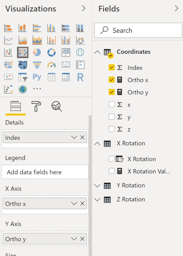
Once you have the two new X and Y measures, add a scatter chart visual to the report. Drag your X measure to the X Axis, Y measure to the Y Axis, and whatever you use for a unique index to Detail.

Conditional Formatting
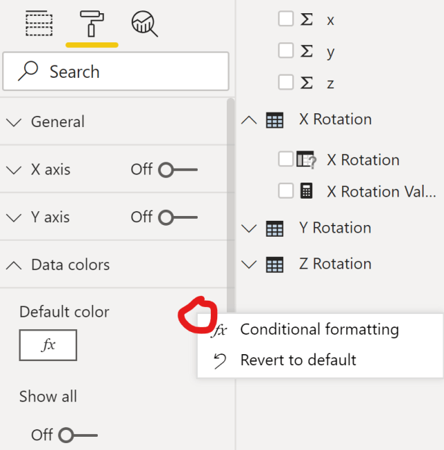
To give a better visual appearance to depth along the z axis, add conditional formatting to the scatter chart. Go to Format and expand Data Colors. Hover over the area and click on the […] that appears, and then select Conditional Formatting.

Since my depth column is simply named z, I chose to base the color scale on “sum of z”. Choose your own field as appropriate. Select a color scale that you would like and any other options before clicking OK.

Finally, I adjusted some other format options like Shape to reduce the point size. With everything built, I now had a “face” in my data that took the 3D coordinates from my original dataset and projected onto the 2D Power BI scatter chart.
Try it!
Here’s a live version of the report to try out, and you can download the sample PBIX file from the Data Stories Gallery.

as per my tweet about geological data. I have lots of data and know where lots is. At least in Alberta. I am looking into this dataset: https://ags-aer.maps.arcgis.com/apps/webappviewer/index.html?id=4fbf09ad8bf940a9b3945e9c9ab57c78 particularly in the pink box. (Fox Creek). I am thinking of plotting this data out via event depth.
Nice. Hope it works out with the multiple layers. I think that some kind of reference line for the z axis might be a challenge in Power BI when using the 3D perspective. I’ll have to put more thought into that aspect.
Very cool David.
Thank you Matt!
One of the coolest Technic i have seen so far using power BI !
Thank you!