
Display Points within a Distance Radius on a Power BI Map
Reading Time: 5 minutes Displaying customers within a given distance radius on a Power BI map was one of my recent challenges. Report consumers would need to be able to make a location selection and see which other points were…
Read More
It’s Time to Reevaluate the Power BI “Map” Visual
Reading Time: 3 minutes One of the first things I tried in Power BI Desktop (née Designer) in late 2014 and early 2015 was the Map visual. Power BI’s mapping capabilities were spartan compared to other tools I was using…
Read More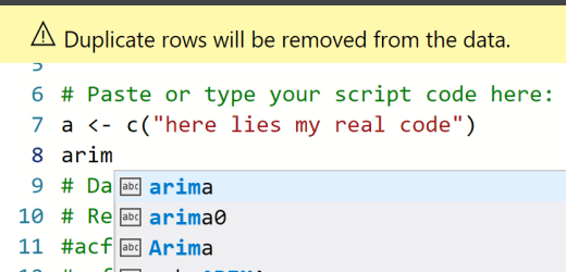
Add Intelligence to R & Python IntelliSense in Power BI
Reading Time: 3 minutes One of the new features that Microsoft announced in February’s Power BI Desktop update is the Improved Python & R Script Editor. The script editor now contains the same features as the DAX editor, including IntelliSense for…
Read More
Speaking at Power Platform World Tour in Chicago
Reading Time: 2 minutes Exciting news! I’ve been invited to speak at the Power Platform World Tour in Chicago. The two day conference takes place Tuesday, April 9 and Wednesday, April 10 in the heart of downtown Chicago. There are also…
Read More
Power BI Color Palette for Charticulator
Reading Time: < 1 minute Charticulator is the first item that I mention in my recent Power BI Best of 2018 in Data Visualization post. It’s an exciting new tool from Microsoft Research to quickly build advanced visuals. Best of all, you can…
Read More