
Reading Time: 3 minutes The Power BI team recently added additional map styles for the Map and Filled Map that make them a more attractive option for data visualization. Alongside the Road and the Aerial themes, Power BI now has…
Read MoreTag: Data Visualization

Introducing the Image Timeline for Power BI
Reading Time: 2 minutes Introducing the Image Timeline, a custom visual for Power BI now freely available on AppSource
Read More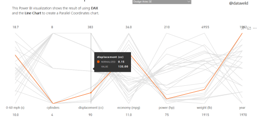
Using DAX to Normalize Data in Power BI
Reading Time: 2 minutes A challenge to which I infrequently return is attempting to create various “new” chart types using only Power BI’s native visuals. For example, I have tried to replicate a Horizon chart and Slopegraph in Power BI…
Read More
10 Ways to Create Maps in Microsoft Power BI
Reading Time: 6 minutes Update March 19, 2018: There are now many more than 10 ways to create maps in Power BI. Get the free Exploring Maps in Microsoft Power BI whitepaper from BlueGranite, and view the companion webinar: Whitepaper: https://www.blue-granite.com/maps-power-bi-whitepaper Webinar: https://www.blue-granite.com/maps-in-power-bi-mar-2018 Original…
Read More
Every Detail Counts
Reading Time: < 1 minute Recently, I encountered a visual created using Power BI’s default color theme that made me take a second look — for the wrong reason. I created an alternate visual that shows the same issue I…
Read More