
Earlier in the year, I published template Theme files for Power BI’s visual settings. These files were not meant to be complete themes but were instead for reference in building your own themes. What happens when Microsoft introduces new Format options for a visual though? The June Power BI Desktop update provides an opportunity to check for new theme properties when the documentation or third-party tools have not yet been updated.
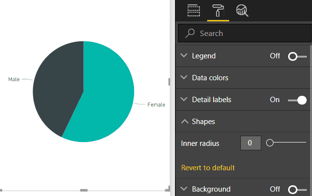
In the June update, the Donut chart received an Inner Radius property while both the Pie and Donut received a Label Position option. Before anyone tries to comment about how round things do not belong in data visualization, know that I hear you. It’s not this post’s topic though. Besides, with a theme file, you can prank your donut-loving colleagues by setting the inner radius to 100. Try doing that in Power BI’s Format area, which only allows you to set a radius to 95…

You might assume that with a new option named Inner Radius under Shapes that the theme might look something like this:
"shapes": [{
    "innerRadius": 90
}]
That’s wrong though and won’t work. The actual addition to the JSON is this:
"slices": [{
    "innerRadiusRatio": 90
}]
Huh? Slices??? Inner Radius Ratio??? How can we figure that out without endlessly guessing? When changes like this occur, you can immediately adjust your Theme files for the new properties using the following process:
- In a Power BI Desktop report, add the visual you want to theme and save the report as a Template. I started using .pbit files for this type of work instead of copying and pasting my .pbix. There’s less chance of me messing up my main report accidentally.
- Extract/unzip the contents of the .pbit file and find the Layout file.
- Open the Layout file in a text editor and search for the visual you want (use Find to help navigate as there’s a lot of text to look through). The inner radius example looks like this:
slices\":[{\"properties\":{\"innerRadiusRatio\":{\"expr\":{\"Literal\":{\"Value\":\"40L\"}}}}}]} - Add the new option you find to your theme file (an entirely new section in this case is slices while the new option is innerRadiusRatio).
Ironically, with the donut’s inner radius set to 0, we get a pie chart. Power BI now has two ways to make a pie chart. Do we still need a separate pie chart visual? Think how avant-garde it would be if Power BI removed pie charts. The marketing would be something like “FIRST BI TOOL TO ABOLISH PIE CHARTS” with Satya waving his hand while they all disappear. All this while secretly retaining the ability to create them using donuts…
I’ve updated my Pie and Donut template files with the new options. We can also update Power BI’s documentation on GitHub and submit pull requests. Maybe our Power BI community could do that too for this and other functionality.
Thanks for these. It’s very helpful.
What I really want though is custom web fonts… one day…