
An accordion for a user interface is a control that expands a relevant section when a user makes a selection and collapses other sections that are not in focus. Whether you use slicers, filters in the filter pane, or crossfilter by selecting elements of visuals; Power BI has extensive versatility to filter data. The “accordion”-style filter for Power BI shown below can be used with either slicers or visuals. The sample I built allows users to click a bar on a bar chart, but almost any visual could work in its place.

Try It!
What is unique for the user is not the way the primary visual is filtered by other visuals–it’s how the filters are presented using an accordion-like control.
Try it out live:
Filter Pane
If you use Power BI’s recently released Filter Pane, you should notice that filters on that pane behave in a similar manner. Accordions are not novel–they’re ubiquitous in many different types of applications. The approach that I took for the custom accordion filter would be like adding the ability to use any type of visual with Power BI’s Filter Pane.

Custom Accordion
The Power BI custom accordion relies on Bookmarks and Buttons as key elements. I’ve only created two categories in my accordion. I’ll be honest–it’s probably more work than it’s worth to keep track of different buttons due to positions as well as what’s visible or hidden for each bookmark. The thought of expanding to three categories is a bit daunting. Why is that?
Bookmarks
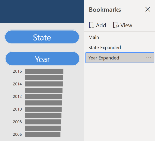
If you have worked with bookmarks in Power BI, you might already be able to guess what the bookmarked setup visibly looks like. For this sample, there are three bookmarks:
The Main bookmark has the accordion elements collapsed.

The State Expanded bookmark shows the State bar chart and moves the position of the Year button.

The Year Expanded button shows the Year bar chart.
Buttons
The bookmarks seem straightforward, right? It’s simply a matter of showing or hiding certain objects as with any bookmark toggle.
The need for several different button objects and positions is where a higher level of complexity comes in though.
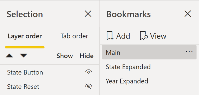
There are actually two overlaid State buttons, not a single State button. That is because the Action setting of the button is not “bookmarkable”. A single button cannot currently launch two different bookmarks. Therefore, the main State Button has an action to view the State Expanded bookmark and the State Reset button has an action to view the Main bookmark. Depending on whether the user is in Main or State Expanded, only one of the state buttons will be visible at a time.

The Year button is more complex because of the position change with the State Expanded bookmark. The Year button shifts downward to allow room for the State bar chart. As a result, there are two buttons in the initial position (one for choosing the Year Expanded bookmark and one for resetting to the Main bookmark). There is an additional year button in the lower position for when the State Expanded bookmark is in use.


I hope you can appreciate why I only tried this with two accordion selections. Three options require four individual buttons for the third category due to having to respond to two possible position shifts, four selections require five buttons for the fourth category, etc. As you can see, expanding the possibilities could be difficult to manage fairly quickly.
This post introduces the concept and is ultimately not a step by step guide to a Power BI accordion control. Please feel free to download the PBIX from GitHub and explore if you’d like to try to recreate this for your own report.