
The Funnel Bar (FUBAR) Chart for Power BI is a new concept that combines the versatility and inherent trustworthiness of the bar chart with the unpredictability of Power BI’s funnel visual.
Why do people use funnels?
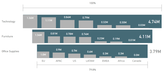
It is well-established tradition that sales reports include visuals where an axis (usually the Y axis) has bars that do not align at zero. Instead, sales “pipelines” and other entities that narrow down from 100% should be visualized with staggered bars reminiscent of a physical funnel.
Why add bars inside the funnel to form a FUBAR chart?
Bar charts add the appearance of accuracy and professionalism to any visual. People trust bar charts. By adding a series of bar charts inside a funnel, Power BI is now able to satisfy both data visualization purists as well as people who require the visual appeal of the funnel.
How do you read a FUBAR chart?
The funnel part of the FUBAR chart represents the total. Each bar in the bar chart shows the contribution to the total. It’s that simple.
With the FUBAR chart for Power BI, now you too can share this advancement in data visualization with your organization. Add a comment below to get a link to the PBIVIZ and sample PBIX file.
****
UPDATED 4/3/2019: Please note the date of post as April Fool’s Day. The FUBAR visual does not exist.
Hey David, leaving this comment will make sure that I get a link? This is easy!
Thanks!
Regards,
Tom
Awesome
Could you please share the .pbix?
I’d be interested to see how it was created.
Very nice graphic. I use the funnel to show the proportion of machines offline in comparison to total machines in use in comparison to the total hours available for all machines (the 100%). It would be interesting to see which machines are involved in the totals 🙂
Many thanks for your blog too – very helpful stuff.
zedleb
I am interested to get a link to the PBIVIZ and sample PBIX file. Thanks.
Hi,
I Lile your chart and like to receive a download link
:thumbsup:
Neat.
Could the grey bars be treemapped to a lower level?
Does it have drill through capabilities eg Category>SubCategory>product?
I am interested in the FunBar, it looks great.
I think this is great visual to have in report.
Interesting mixture! I would appreciate a link.
Are you going to put it into the app store?
Will it be usable in Continental Europe (comma as decimal sign)?
As other receivers of your mailing list, i’m eager to receive a link to get acces to PBIVIZ and sample PBIX file. Thanks.
I’ll add my name to the receive a link to get access to PBIVIZ and sample PBIX file.
Very nice visual approach
Hi David,
Very interesting visual, could I receive the download link? Thanks.
Could you please share the .pbix?
Mala broma
Could you please share the .pbix?